Case study
Improving a Critical Patient Touchpoint
Challenge
Genome Medical’s RISE platform is the primary patient touchpoint for each of its customer partnerships. The platform had started to fall behind its competitors, having not seen significant changes since the launch of its MVP. Critically, it failed to address the patient referral source and made assumptions about optimization without patient input. Lastly there was a lack of effective product instrumentation to inform product direction.
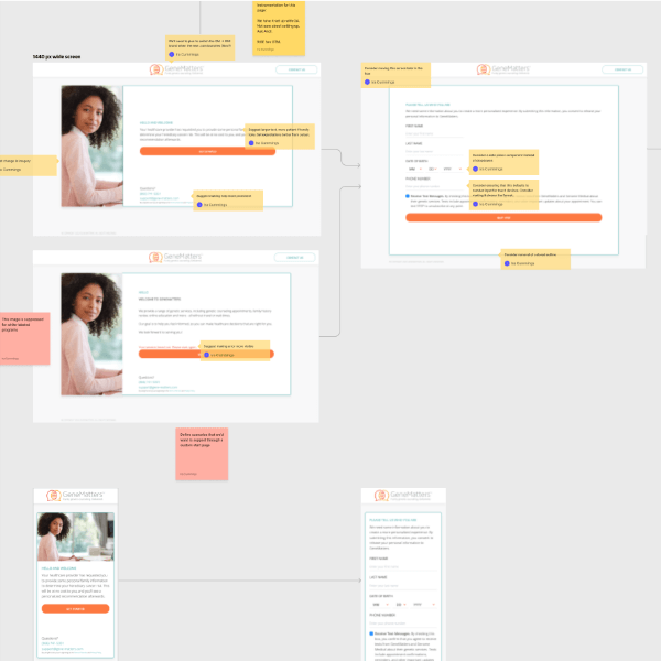
The entire flow was documented, with opportunities for improvement highlighted. This became a critical document for discussing iteration.
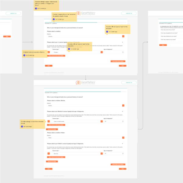
I made sure to note parts of the experience with confusing interaction patterns. These could adopt patterns from elsewhere for increased usability.
Approach
Working with close collaborators, I embarked on a project to improve these issues. First, we mapped out the full user paths and logic of the existing user experience, identifying pain points along the way. We then created quick sketches and scheduled a work session to explore potential solutions. Through this process, we identified areas of improvement and worked closely with the product manager and engineering team to address them. The new improvements were incrementally rolled out alongside a brand refresh.
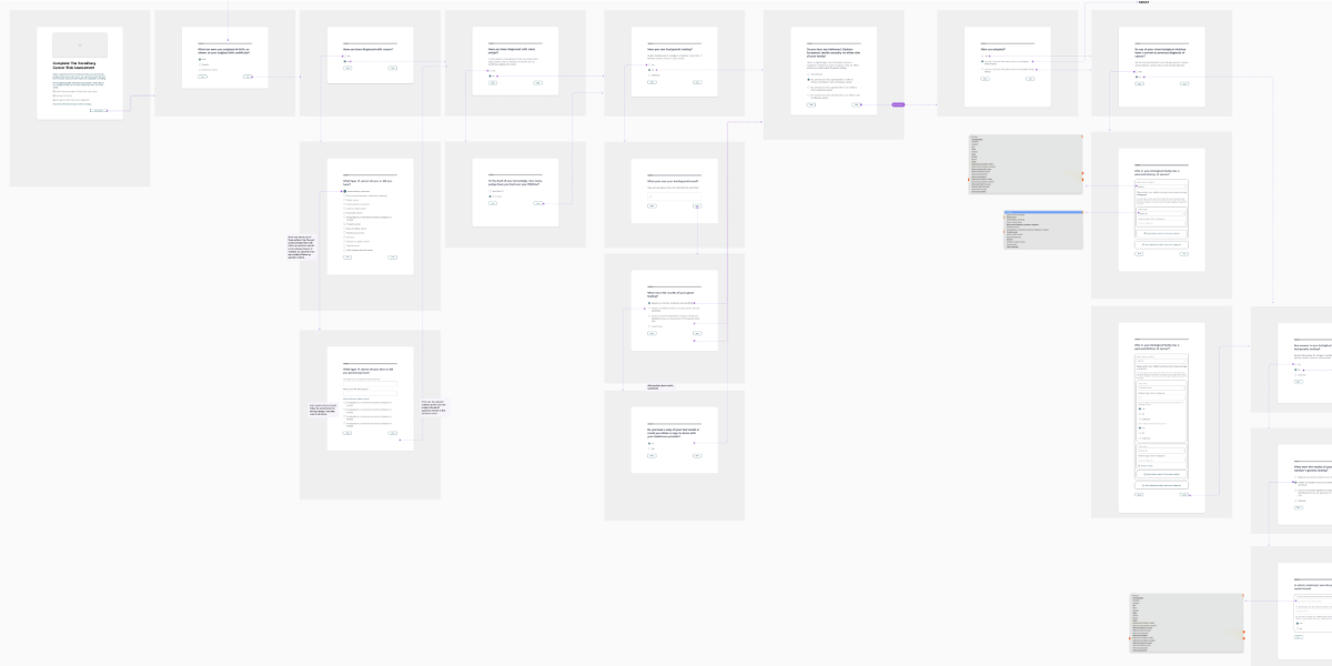
Working quickly was essential. I mapped out a wireflow of an improved experience to drive discussions with product and engineering counterparts. It was also used with a pattern library to create the improved experience.
Outcomes
The experience that we implemented consisted of several key elements. First, we focused on creating a more streamlined interaction design, eliminating unnecessary steps, and making the remaining steps clearer for users. We also introduced componentized UI elements to enhance the consistency of the overall user experience. And last but not least, we updated the visual presentation to surpass our competitors and present a modern, usable interface.
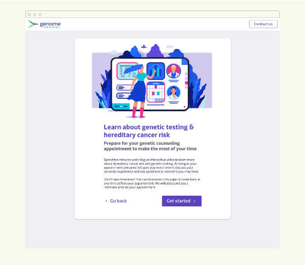
A more inviting welcome screen with improved content, CTA, and friendly illustration
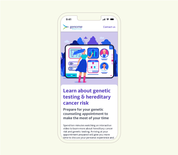
All screens were designed to be mobile-first. Patients could complete the experience in a waiting room if desired.
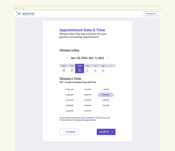
I was able to improve the interaction design of the scheduling experience by lowering cognitive demand and simplifying interactions
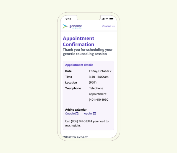
At the end of the experience, users have clear information and next steps
Impact
It's still early to report back on quantative data, as this project hasn't fully launched to all customer programs. However, the platform has become more usable and has leapfrogged the competition in terms of presenting a modern and user-friendly interface.
All Case Studies